· In: Design, Uncategorized
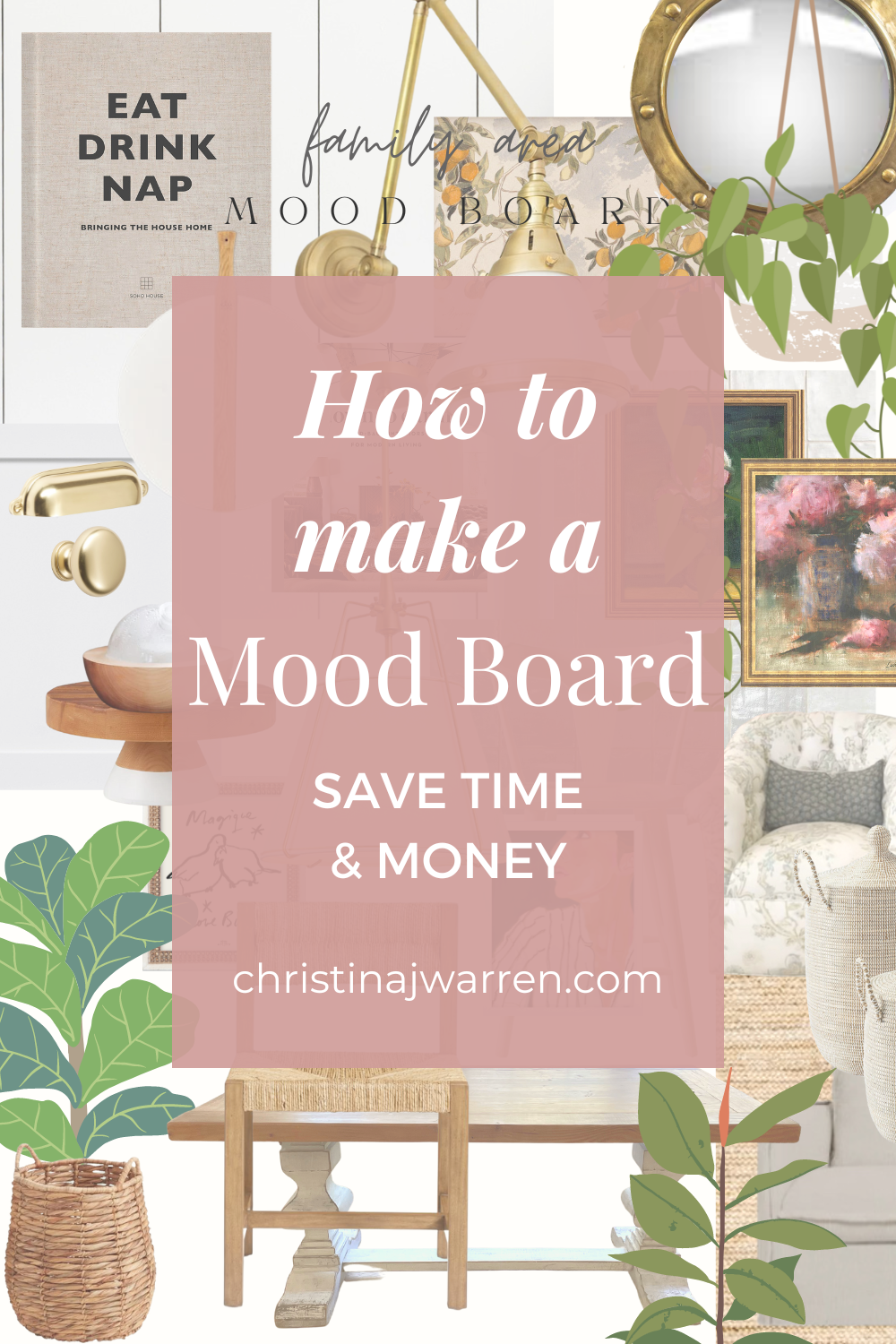
Creating a mood board and color palette for your space will save you so much time and money when selecting items for your design! I resisted doing these for so long. I would look at the room and imagine a new piece of furniture, art or even a kitchen towel just trying to guess what it would look like. Sometimes it worked and other times it didn’t.
I’m going to show you the process and my tools to do this. It’s not only fun but super satisfying!
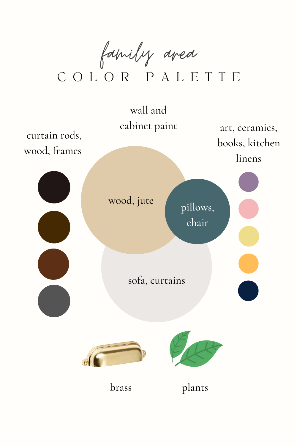
I love a neutral palette with pops of color or contrast. First I create the color palette. I do this all in the CANVA app. You can do this in the free version but the paid version gets you the “background” remover tool which makes for a really visually pleasing mood board.
The background of my color palette is the paint color of the walls and cabinets. Then I have my other main neutral colors of rugs and large furniture. The accents are along the right hand side. I made this in Canva as well. Just some circles and colors I have and love.
Now for the mood board! I put in a mix of images I pulled from online as well as photos I took of our furniture and key pieces. You can screen shot the items on your phone and load everything onto the app. I even put in some shiplap.
If you asked me what my favorite design colors were, I honestly don’t think I’d say orange or turquoise but that is what I’m truly drawn to! It makes sense when you see it all laid out.
Add in some plants, your fixtures, lighting and books that feel like you. Click on “elements” for little graphic items like plants. See my faves HERE. You can layer them by overlapping and placing some in the foreground and some in the background on the app. I have a piece of our rug, and major furniture items.
Our living area is all open so I consider the surrounding areas and views when making a board.
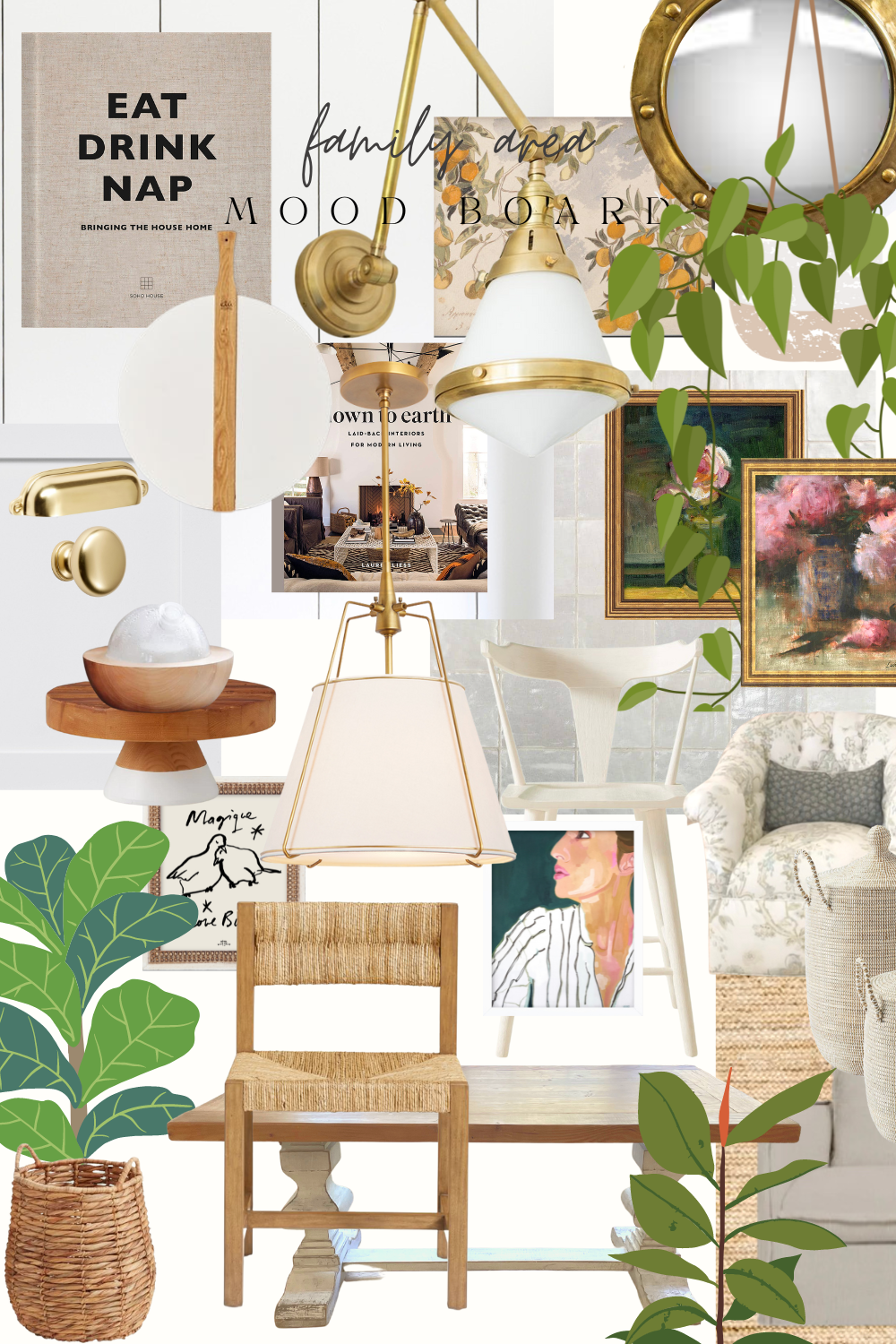
Here I placed in a dining chair I’m considering to see if it goes with the overall feel of the space and I LOVE how it looks! This is going to be your HUGE time and money saver. Less returns and less time wondering if something is going to feel right.
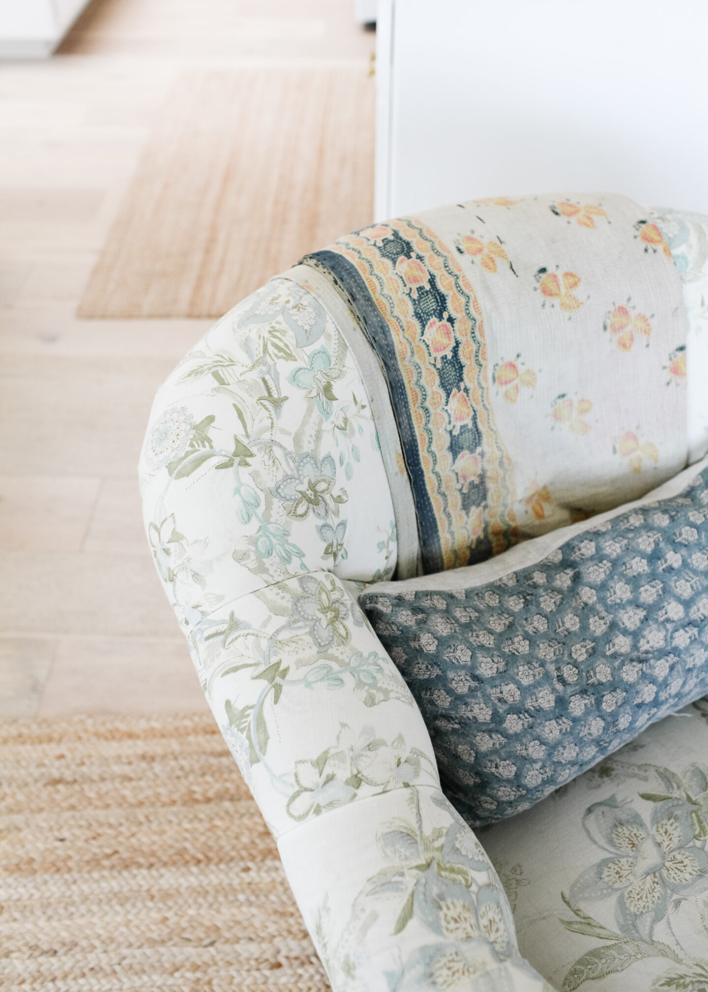
When you have your color palette, you can more easily mix and match patterns. I love finding a beautiful vintage Kantha that combines your color scheme. It will bring everything together and give a lived in feel.
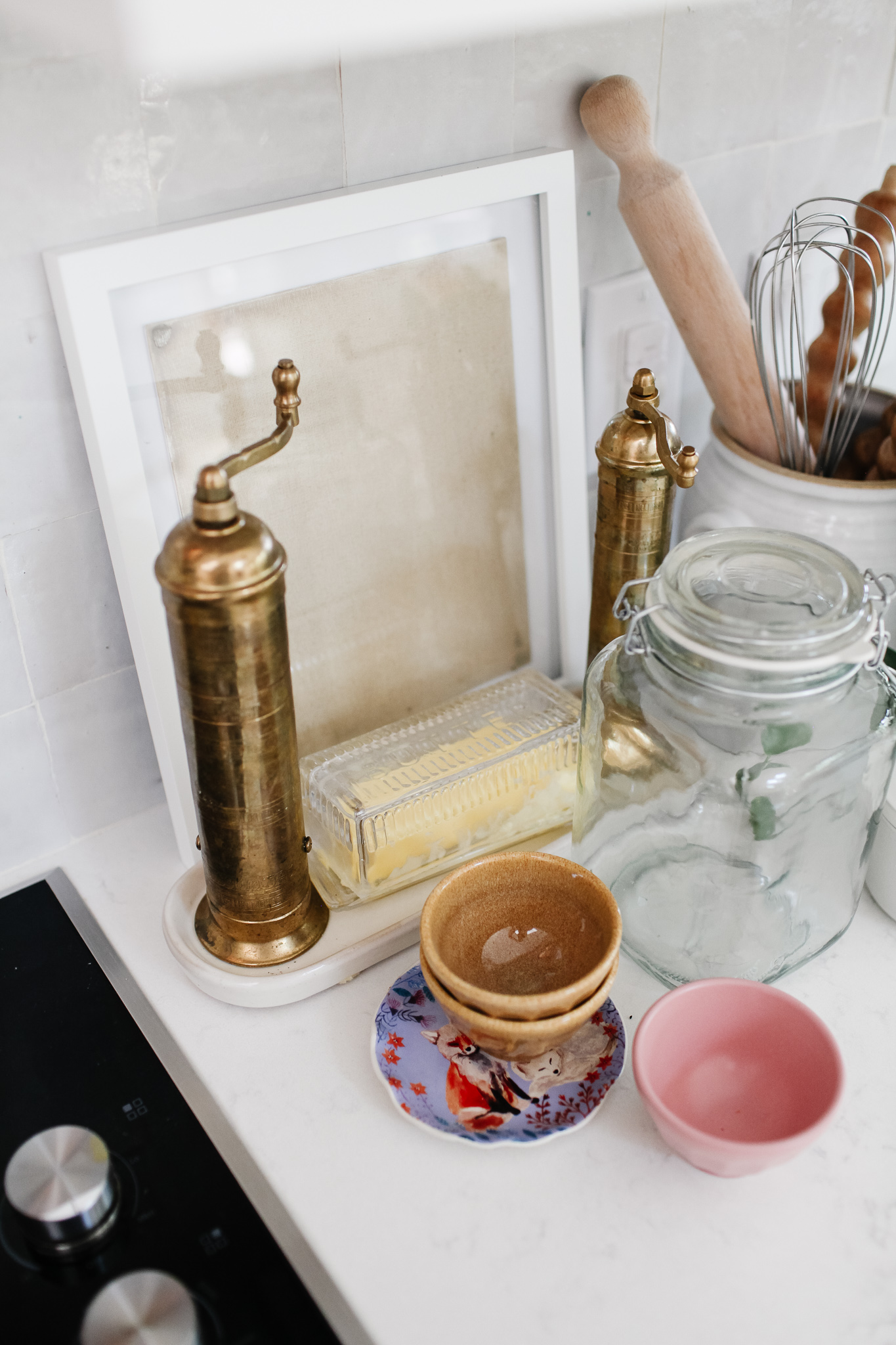
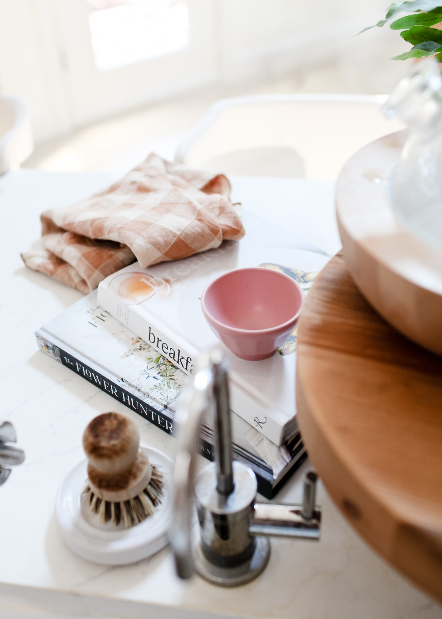
Play around with ways to mix in color like little ceramics or tea towels. For more on our fixtures and decor, read this post.
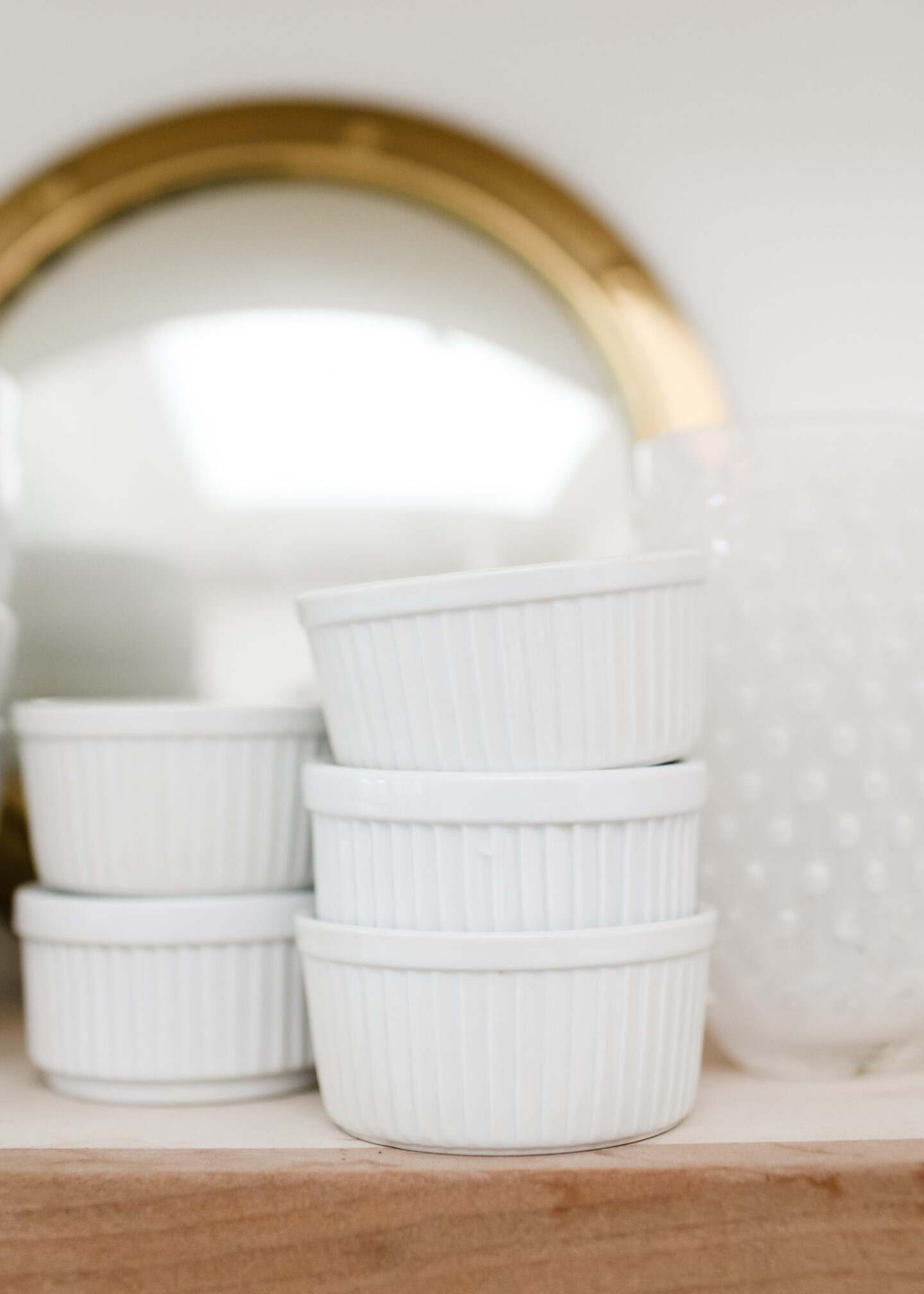
Have areas of calm that are monochromatic and neutral to set an anchor for your design. You can switch up the accessories with the seasons, your mood and what you find when you’re shopping.

Have fun with color! Pop in a tone that’s in the family of your palette. I love adding a little lilac and it complements the pink while contrasting yellows and oranges. A basket tray is a great design element to add interest. I have diffusers all around the house to make it cozy and smell dreamy.
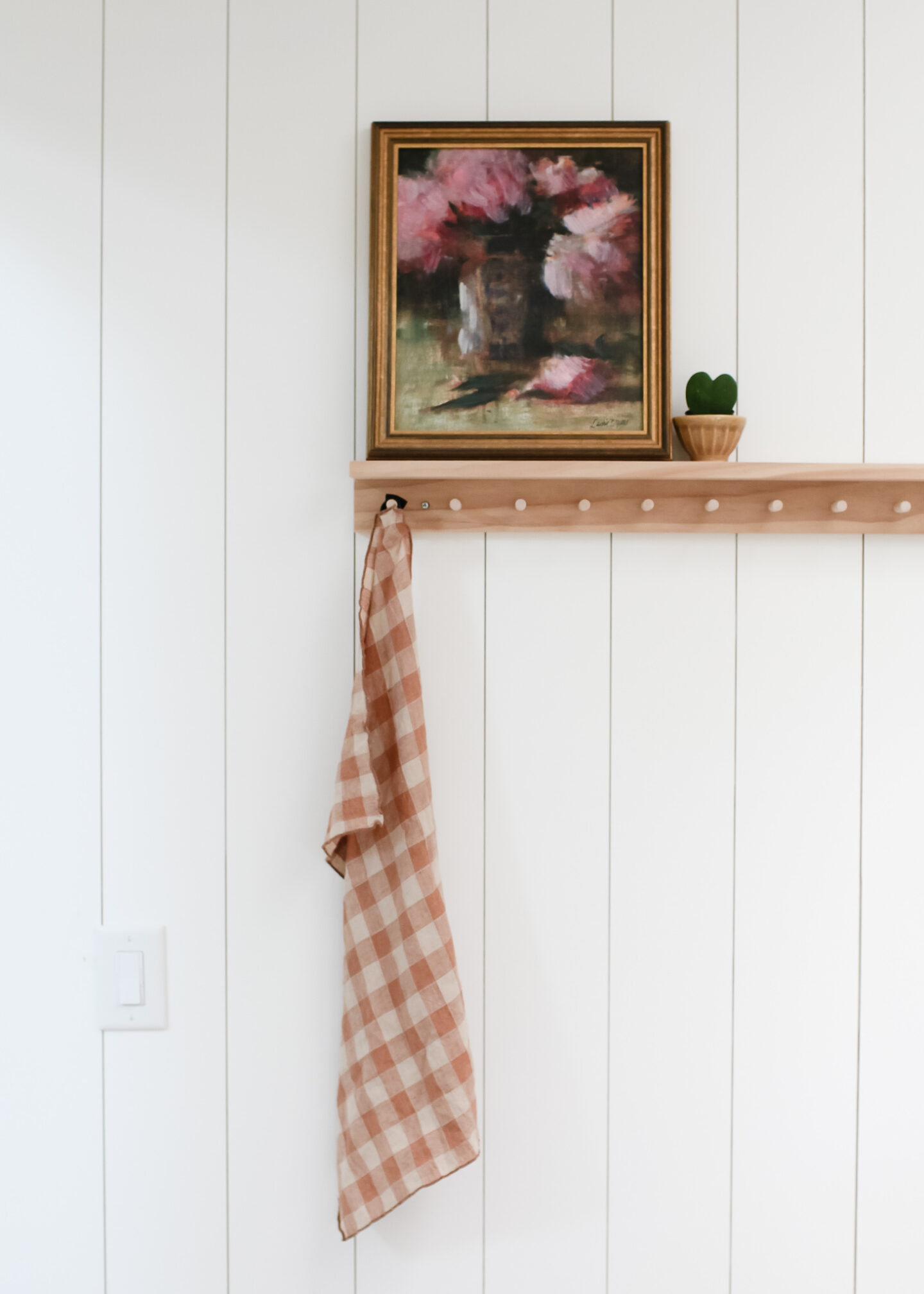
Look for graphic interest like this gingham linen tea towel to make things interesting. This color flows with the design and gives some life. Add plants and choose planters that marry well too! Anything can be a planter! I used a little snack dish here for this heart Hoya.

Most importantly, HAVE FUN! This is a journey, not just a destination so play and don’t be afraid to make mistakes. The mood board and color palette are a guideline for overall cohesion but excellent design breaks the rules!
A gentle weekly digest for high-achieving women who want peace and permission to trust themselves-through energy awareness, homemaking and small habits for big happiness.

Leave a Reply
You must be logged in to post a comment.